Plotting Connectivity Matrices
Disclaimer: I originally wrote this guide for an RA around 2014 and cannot guarantee it is relevant or up-to-date when you are reading it.
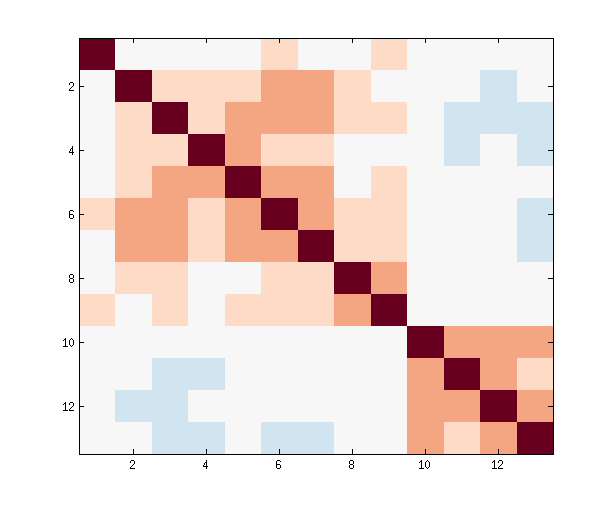
Many fMRI connectivity pipelines produce text files containing pairwise correlations between many brain regions. Looking at the text alone can be confusing. Also, certain information, like community structure, is not obvious in text format. This guide discusses options for turning connectivity matrices from text format into graphical format. The following is a text format connectivity matrix generated from a processing pipeline run on a resting-state fMRI scan of my brain:
| 1 | 2 | 3 | 4 | 5 | 6 | 7 | 8 | 9 | 10 | 11 | 12 | 13 | |
|---|---|---|---|---|---|---|---|---|---|---|---|---|---|
| 13 Occipital Pole | 0.02 | -0.05 | -0.13 | -0.13 | -0.04 | -0.13 | -0.12 | -0.01 | -0.09 | 0.34 | 0.24 | 0.39 | 1.00 |
| 12 Lateral Occipital Cortex | 0.06 | -0.09 | -0.10 | -0.05 | -0.01 | -0.03 | -0.07 | -0.01 | -0.09 | 0.40 | 0.28 | 1.00 | 0.39 |
| 11 Lateral Occipital Cortex | 0.03 | -0.03 | -0.10 | -0.09 | -0.07 | -0.07 | -0.06 | -0.05 | -0.09 | 0.29 | 1.00 | 0.28 | 0.24 |
| 10 Intracalcarine Cortex | 0.05 | -0.04 | -0.05 | -0.08 | -0.01 | -0.04 | -0.04 | -0.05 | -0.07 | 1.00 | 0.29 | 0.40 | 0.34 |
| 9 Lingual Gyrus | 0.19 | 0.09 | 0.24 | 0.08 | 0.10 | 0.24 | 0.15 | 0.31 | 1.00 | -0.07 | -0.09 | -0.09 | -0.09 |
| 8 Temporal Occipital Fusiform Cortex | 0.08 | 0.15 | 0.17 | 0.04 | 0.08 | 0.26 | 0.25 | 1.00 | 0.31 | -0.05 | -0.05 | -0.01 | -0.01 |
| 7 Occipital Pole | 0.00 | 0.41 | 0.42 | 0.24 | 0.27 | 0.39 | 1.00 | 0.25 | 0.15 | -0.04 | -0.06 | -0.07 | -0.12 |
| 6 Intracalcarine Cortex | 0.13 | 0.28 | 0.30 | 0.19 | 0.31 | 1.00 | 0.39 | 0.26 | 0.24 | -0.04 | -0.07 | -0.03 | -0.13 |
| 5 Lateral Occipital Cortex | 0.04 | 0.11 | 0.31 | 0.32 | 1.00 | 0.31 | 0.27 | 0.08 | 0.10 | -0.01 | -0.07 | -0.01 | -0.04 |
| 4 Intracalcarine Cortex | -0.01 | 0.15 | 0.26 | 1.00 | 0.32 | 0.19 | 0.24 | 0.04 | 0.08 | -0.08 | -0.09 | -0.05 | -0.13 |
| 3 Intracalcarine Cortex | 0.04 | 0.22 | 1.00 | 0.26 | 0.31 | 0.30 | 0.42 | 0.17 | 0.24 | -0.05 | -0.10 | -0.10 | -0.13 |
| 2 Lateral Occipital Cortex | 0.02 | 1.00 | 0.22 | 0.15 | 0.11 | 0.28 | 0.41 | 0.15 | 0.09 | -0.04 | -0.03 | -0.09 | -0.05 |
| 1 Frontal Orbital Cortex | 1.00 | 0.02 | 0.04 | -0.01 | 0.04 | 0.13 | 0.00 | 0.08 | 0.19 | 0.05 | 0.03 | 0.06 | 0.02 |
Here is the same connectivity matrix in graphical format:
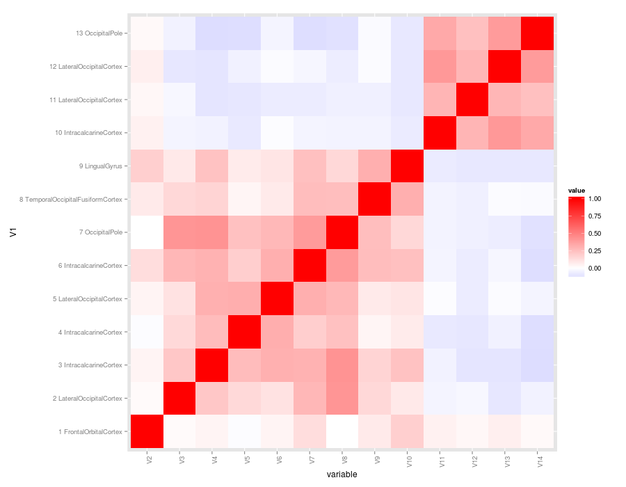
We will be working with this 13 x 13 matrix for the entire guide (link to csv). The most common way to visualize connectivity matrices is to show the correlation values as colors. This type of plot is referred to as a heatplot or heatmap because stronger connections are usually plotted in warmer colors (although it is always possible to use any color scheme you want). There is no shortage of tools to make heat plots. Below is a review of some popular options using R, Matlab, and Python. Disclaimer: I cannot provide support for any method you see in this guide, but hopefully I've been descriptive enough to help you google your way to plotting success. I created this to document the many ways I encountered in the course of a recent analysis. I hope someone finds the comparison useful as an analysis of difficulty versus output quality.
Plotting with R
All of the R methods require you load in a text file. Also, some of the methods reference a gradient of colors to map the region-to-region correlations onto. The following block does those initial steps:
# Load connectivity matrix
csv <- read.csv("matrix.csv", header=F)
# Set a gradient of colors that we will use for as many of the plots as possible
# The gradient goes from blue (negative correlations) to white (0) to red (positive correlations)
cols2 <- colorRampPalette(c("blue","white","red"))(256)
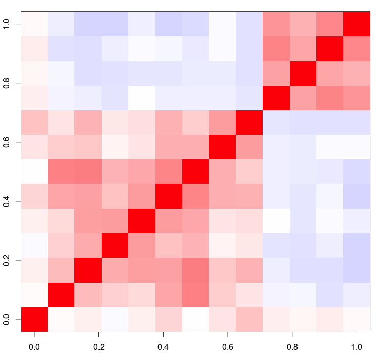
1. base r image()
The easiest method in R is the image() function, which requires no outside packages be installed on your machine.
# Notice how we are only using columns 2 through 14 for the plot.
# The first column contains the region labels
image(as.matrix(csv[,2:14]),  col = cols2, zlim=c(-1, 1))
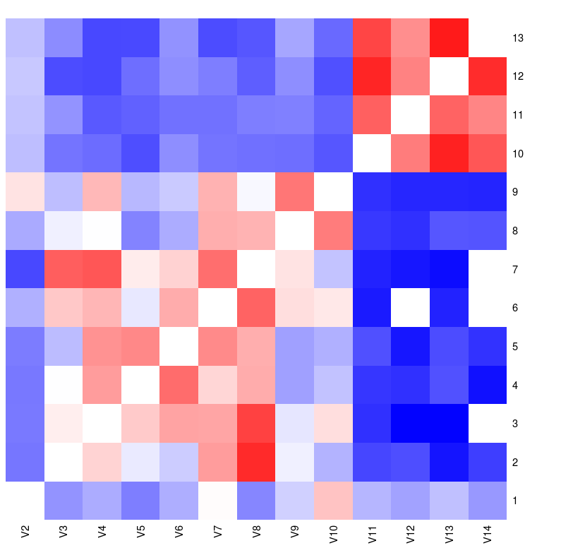
2. r with lattice heatmap() function
The Lattice package must be installed for the next two methods.
library(lattice)
heatmap(as.matrix(csv[,2:14]), Rowv=NA, Colv=NA, col = cols2, zlim=c(-1, 1))
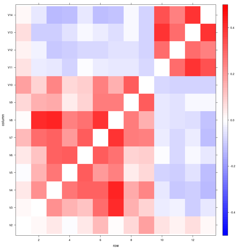
2. r with lattice levelplot() function
library(lattice)
levelplot(as.matrix(csv[,2:14]), at=seq(-.5, .5, .01), col.regions=cols2)
3. ggplot
This method requires reshape2 and ggplot2. I think ggplot2 produces a very nice heatplot with still minimal effort. I especially like how easy it is to add and adjust axis labels.
library(reshape2)
library(ggplot2)
csv.m <- melt(csv, id.vars="V1")
csv.m$V1 <- factor(csv.m$V1, levels=unique(as.character(csv.m$V1)) )
qplot(x=variable, y=V1, data=csv.m, fill=value, geom="tile") + theme(axis.text.x = element_text(angle = 90, hjust = 1)) + scale_fill_gradient2(low = "blue", mid = "white", high = "red")
Plotting with Matlab
Plotting something similar to the R output is pretty easy. By default, the color mapping is really inappropriate for connectivity matrices, but that is easily resolved with the colormap function.
csv = csvread('matrix.csv')
csv_plot = imagesc(csv)
colormap(redbluecmap(-1,1))
Plotting with Python
One problem I faced with options like the ones presented above is that they scale poorly to very large connectivity matrices. Often times, you cannot tell which tiles correspond to which relationships. In the process of exploring connectivity between several hundred regions, I realized it would be useful to have a hover function to clarify which pair of nodes the currently selected tile corresponds to. The “bokeh” package for python provides a framework for creating interactive visualizations in javascript. I adapted one of their examples to accomodate brain connectivity matrics. This was pretty straightforward to do on my local machine, but the output is hard to share. Also, it looks like bokeh was updated to version 0.6.0 while I wrote this guide. The updated version produces slightly different output than what is displayed below. I used bokeh 0.4.4-530-ga704009 for this demo. Good luck if you choose to go down the interactive visualization path.
Code: